
By TrivBits, Staff Writer — Published October 6, 2026
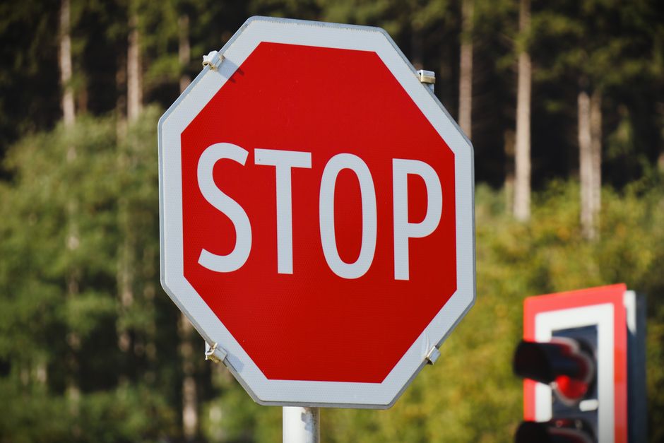
Table of Contents
- Key Takeaways
- Why Stop Signs Are Octagonal: The Original Safety Logic
- The Surprising Evolution of Stop Sign Colors
- Shape Recognition and Driver Psychology
- Global Adoption and Variations
- Modern Manufacturing and Retroreflective Technology
- Frequently Asked Questions
- Sources
Every driver recognizes the red octagon instantly. But have you ever wondered why stop signs are octagonal rather than square, circular, or triangular? This distinctive eight-sided shape wasn’t chosen randomly. It emerged from a fascinating 1920s effort to standardize American roads and create a visual language that could save lives—even when drivers couldn’t read the words printed on signs.
The story behind this ubiquitous traffic symbol reveals surprising truths about early automotive culture, competing municipal standards, and the psychology of shape recognition. Did you know that stop signs weren’t always red, and their octagonal shape predates the color we associate with them today?
Key Takeaways
- Stop signs became octagonal in 1923 when the American Association of State Highway Officials recommended standardizing road signs across the United States.
- The eight-sided shape was chosen specifically so drivers could recognize a stop sign from its silhouette alone, even from behind or when covered in snow.
- Early stop signs were actually yellow with black letters, not red—the familiar red color wasn’t standardized until 1954.
- The octagon was selected as the most distinctive shape available, reserved exclusively for stop signs to maximize driver recognition.
- Shape-based sign systems were critical in an era when many drivers had limited literacy and nighttime visibility was poor.
- The octagonal design has remained essentially unchanged for a century, proving the effectiveness of the original decision.
Why Stop Signs Are Octagonal: The Original Safety Logic
Before the 1920s, American roads were chaos. Each city designed its own traffic signs with little coordination. Detroit might use one style while Chicago used another entirely. As automobiles multiplied and interstate travel became common, this patchwork system created dangerous confusion.
The octagonal shape solved a critical problem: instant recognition regardless of viewing angle or conditions. A driver approaching an intersection from any direction could identify the distinctive eight-sided silhouette. Even if snow covered the sign face or dirt obscured the lettering, that unique geometric profile communicated “stop” without words.
This was brilliant design thinking for its time. Engineers understood that split-second recognition could mean the difference between safe stops and collisions. The octagon provided maximum corners and angles to catch light and create visual distinction, while remaining simple enough to manufacture consistently.
Interestingly, the shape hierarchy established in the 1920s assigned different geometries to different warning levels. Circular signs indicated railroad crossings, diamonds warned of general hazards, and rectangles provided directional information. The octagon stood alone, reserved exclusively for the most critical command: stop.
The Surprising Evolution of Stop Sign Colors
Here’s an interesting fact that surprises most people: stop signs weren’t originally red. The first standardized stop signs were yellow with black lettering. Why yellow instead of red?
The answer involves paint technology. In the 1920s and 1930s, fade-resistant red paint didn’t exist for outdoor use. Red pigments available at the time would deteriorate quickly under sun exposure, becoming pink or orange within months. Yellow paint, however, remained stable and visible in all weather conditions.
The switch to red occurred in 1954 when durable, fade-resistant red enamel paints became available. Red was always the preferred color psychologically—it signals danger and urgency across cultures—but practical limitations delayed its adoption for three decades. Once technology caught up with intent, the transformation happened nationwide.
Some rural areas retained yellow stop signs into the 1970s, creating an unintentional time capsule of automotive history. Today, the red octagon is so universal that it appears in the Vienna Convention on Road Signs and Signals, making it one of the few truly global traffic symbols.
Shape Recognition and Driver Psychology
The octagonal decision reflects deep understanding of human perception. Our brains process shapes faster than words or even colors. In the fraction of a second available when approaching an intersection, geometric recognition happens almost instantaneously.
Research into driver behavior has validated this 1920s intuition. Studies show that drivers begin processing stop signs from greater distances than other traffic control devices, largely due to the distinctive shape. The octagon creates visual “pop” that circular or rectangular signs cannot match.
The eight-sided configuration also provides practical advantages for retroreflectivity. Multiple angles catch and bounce back headlight beams more effectively than smoother shapes. This matters enormously for nighttime driving safety, when sign visibility becomes most challenging.
Peripheral vision responds to the octagon’s sharp angles too. Even when drivers aren’t looking directly at an intersection, the distinctive silhouette registers in peripheral awareness, triggering attention shifts that prevent accidents.
Global Adoption and Variations
The octagonal stop sign spread far beyond American highways. Most countries worldwide have adopted the design, making it perhaps the most universally recognized traffic symbol on Earth. Canada, Mexico, Australia, and most European nations use identical or nearly identical octagonal stop signs.
Some interesting variations exist, however. Japan uses inverted red triangles for stop signs rather than octagons, reflecting different standardization choices made in the mid-20th century. A few European countries experimented with circular stop signs before eventually conforming to the octagonal standard.
The word printed on the sign varies by language—”STOP” in English, “ALTO” in Spanish, “ARRÊT” in French—but the shape remains constant. This demonstrates the original design philosophy: the shape communicates even when words don’t.
Modern Manufacturing and Retroreflective Technology
Today’s stop signs look similar to their 1920s ancestors but incorporate sophisticated materials. Modern signs use aluminum substrates with specialized retroreflective sheeting that bounces light directly back toward its source—your headlights.
These retroreflective materials contain millions of tiny glass beads or prismatic structures. When headlight beams strike the sign surface, the geometry of these microstructures redirects light back along nearly the same path, making signs appear to glow in darkness.
The octagonal shape actually enhances this effect. Eight flat planes angled around a central point create multiple opportunities for light reflection regardless of approach angle. A circular sign, by contrast, curves away from light sources, reducing effectiveness.
Manufacturing standards now specify exact dimensions, color tolerances, and reflectivity minimums. In the United States, the Manual on Uniform Traffic Control Devices dictates that standard stop signs measure 30 inches across, with larger 36-inch versions used on multilane roads.
Frequently Asked Questions
Why don’t other countries use octagonal stop signs?
Most countries actually do use octagonal stop signs—it’s one of the most internationally standardized traffic symbols. Japan is the notable exception, using inverted red triangles instead. This difference stems from Japan’s post-World War II traffic standardization, which occurred independently of Western conventions. However, the vast majority of nations worldwide have adopted the octagonal design.
When did stop signs change from yellow to red?
Stop signs officially changed from yellow to red in 1954 in the United States. The delay wasn’t due to preference but technology—fade-resistant red paint suitable for outdoor use didn’t exist until the 1950s. Yellow provided better durability and visibility with earlier paint formulations. Once improved red enamel became available, the transition occurred because red more effectively signals danger and urgency.
Are there any legal stop signs that aren’t octagonal?
In the United States and most countries that follow the Vienna Convention on Road Signs and Signals, legitimate regulatory stop signs must be octagonal. Any non-octagonal stop sign would not meet legal standards for traffic control devices. However, private property sometimes features non-standard signs, though these lack legal enforcement authority and can create confusion.
Why is the octagon shape only used for stop signs?
The octagon was deliberately reserved exclusively for stop signs to maximize recognition and prevent confusion. Traffic engineers in the 1920s established a shape hierarchy where each geometric form conveyed specific meaning. By making the octagon unique to stop signs, they ensured drivers would never mistake a stop command for any other instruction, even at a glance or in poor visibility.