1 / 10 Questions
0 Points

What force keeps planets orbiting around the Sun?

Inertia

Magnetism

Friction

Gravity

Points won
0
Correct score
0%

More Questions

More Articles

Why Carrots Turned Orange: The Political History Revealed

Why Carrots Turned Orange: The Political History Revealed

Why Carrots Turned Orange: The Political History Revealed

By TrivBits, Staff Writer — Published August 10, 2026

Table of Contents

Walk through any grocery store produce aisle today and you'll find rows of bright orange carrots. But this wasn't always the case. For most of history, carrots came in purple, white, yellow, and red—almost any color except orange. The surprising truth about why carrots turned orange involves Dutch growers, political allegiance, and a royal family whose favorite color happened to match their national identity. This fascinating transformation reveals how agriculture, politics, and national pride can intersect in the most unexpected ways. The story of the orange carrot is one of those amazing trivia facts that makes you question everything you thought you knew about everyday vegetables. What began as a deliberate cultivation effort in the 16th and 17th centuries became the standard we recognize today, erasing centuries of colorful carrot diversity from common memory.

Key Takeaways

  • Carrots were originally purple, white, yellow, and red—orange varieties were rare or nonexistent in ancient times.
  • Dutch growers in the 16th and 17th centuries selectively bred orange carrots, likely to honor the House of Orange-Nassau.
  • Orange carrots contained higher levels of beta-carotene, making them both politically symbolic and nutritionally superior.
  • The orange variety's sweetness and robust flavor helped it dominate global agriculture by the 18th century.
  • Purple and yellow heirloom carrots are making a comeback in farmers' markets, reconnecting us with pre-orange carrot history.
  • The political breeding program succeeded so completely that most people today don't realize carrots came in other colors first.

When Carrots Turned Orange: The Dutch Connection

Historical records show that carrots were cultivated in Afghanistan and Persia as early as the 10th century, but these ancient vegetables bore little resemblance to modern orange carrots. Purple carrots dominated Eastern cultivation, while white and yellow varieties appeared across Europe and the Middle East. These colorful ancestors were often woody, bitter, and far less palatable than today's sweet, crunchy versions. The transformation happened in the Netherlands during a period of intense national pride. Dutch growers began systematically crossbreeding yellow carrot varieties with existing stocks, selecting for deeper orange hues and sweeter flavor profiles. While the exact timeline remains debated among agricultural historians, the orange carrot became widespread in Dutch markets by the late 1600s. The House of Orange-Nassau ruled the Dutch Republic and later the Kingdom of the Netherlands. Orange served as both the royal color and a symbol of Dutch independence from Spanish rule. Whether the carrot breeding program was explicitly political or simply a happy coincidence remains unclear, but Dutch growers certainly recognized the patriotic value of their orange vegetables. The timing was perfect: as the Netherlands emerged as a global trading power, their distinctive orange carrots spread worldwide.

The Science Behind the Color Change

Orange carrots get their distinctive hue from beta-carotene, a pigment the human body converts into vitamin A. Purple carrots contain anthocyanins instead, the same compounds that color blueberries and red cabbage. Yellow varieties have xanthophylls, while white carrots lack significant pigmentation altogether. Dutch growers didn't understand the biochemistry, but they noticed that their orange varieties tasted sweeter and stored better than traditional purple carrots. The beta-carotene that created the orange color also contributed to improved flavor and texture. These practical advantages, combined with the symbolic appeal, made orange carrots increasingly popular across Europe. Selective breeding intensified the orange color over generations. Early orange carrots were likely pale compared to modern varieties. Growers saved seeds from the brightest, sweetest specimens each year, gradually concentrating the genes responsible for beta-carotene production. This patient, multi-generational effort created the deep orange carrots we know today.

How Orange Carrots Conquered the World

By the 18th century, orange carrots had become the European standard. Their superior taste and nutritional value gave them advantages beyond political symbolism. British, French, and German gardeners adopted Dutch varieties, spreading them throughout their colonial empires. Purple and yellow carrots didn't disappear entirely—they persisted in isolated pockets and heirloom seed collections. But commercial agriculture favored uniformity and reliability. Orange carrots delivered consistent results, shipped well, and appealed to consumers. Within a few generations, most people forgot that carrots had ever been any other color. The 20th century cemented orange carrot dominance. Industrial agriculture and global food distribution systems prioritized varieties that grew uniformly, harvested mechanically, and survived long-distance transport. Orange carrots checked every box. Seed companies focused their breeding programs on improving orange varieties, leaving other colors as agricultural curiosities.

Comparing Carrot Varieties: A Rainbow Recovered

Carrot Color Primary Pigment Flavor Profile Historical Origin
Orange Beta-carotene Sweet, mild Netherlands, 16th-17th century
Purple Anthocyanins Peppery, earthy Afghanistan, Persia, 10th century
Yellow Xanthophylls Mild, slightly sweet Middle East, medieval period
White Minimal pigmentation Mild, sometimes bitter Europe, ancient cultivation
Red Lycopene Sweet, slightly peppery Asia, various periods

The Modern Heirloom Revival

Something interesting happened in recent decades. Farmers' markets and specialty grocers began offering purple, yellow, and red carrots again. These "rainbow carrots" aren't new—they're revivals of ancient varieties that predated the Dutch orange revolution. Seed preservation organizations like the Seed Savers Exchange maintain collections of pre-orange carrot varieties. Chefs prize them for visual appeal and subtle flavor differences. Home gardeners discover that purple carrots aren't just novelties—they're links to centuries of agricultural history erased by orange carrot dominance. The nutritional differences matter too. Purple carrots offer anthocyanins with antioxidant properties distinct from beta-carotene. Yellow varieties provide xanthophylls that support eye health. Eating a rainbow of carrot colors delivers a broader spectrum of beneficial compounds than orange alone.

Frequently Asked Questions

Were carrots always orange before Dutch breeding?

No, carrots were originally purple, white, yellow, and red. Orange carrots became common only after Dutch growers selectively bred them in the 16th and 17th centuries, likely to honor the House of Orange-Nassau.

Are purple carrots just dyed orange carrots?

Not at all. Purple carrots are distinct heirloom varieties that predate orange carrots by centuries. Their color comes from anthocyanins, the same natural pigments found in blueberries, not from any artificial dye.

Do different colored carrots taste different?

Yes, though the differences are subtle. Orange carrots tend to be sweetest, purple varieties have a slightly peppery or earthy flavor, yellow carrots are mild, and white carrots can be blander or occasionally bitter.

Why did orange carrots become the standard worldwide?

Orange carrots combined superior sweetness, better storage qualities, and higher nutritional value with the symbolic appeal of Dutch national pride. These advantages helped them spread globally through trade networks and eventually dominate commercial agriculture. The next time you crunch into an orange carrot, remember you're eating a vegetable shaped by political loyalty, selective breeding, and centuries of agricultural dedication. Those forgotten purple ancestors still exist, waiting in heirloom seed banks and specialty farms, ready to remind us that even the most ordinary vegetables have extraordinary hidden histories.

Why Stop Signs Are Octagonal: The Shape Safety Story

Why Stop Signs Are Octagonal: The Shape Safety Story

Why Stop Signs Are Octagonal: The Shape Safety Story

By TrivBits, Staff Writer — Published July 31, 2026

Table of Contents

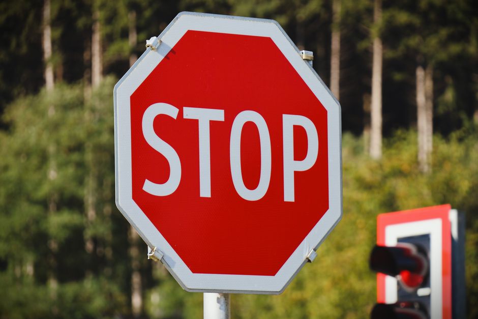
Every day, drivers around the world encounter the bright red octagon commanding them to halt. But why are stop signs octagonal? The answer reveals a clever piece of design thinking from the early days of automotive traffic control. Unlike circular or rectangular signs, the eight-sided shape serves a specific safety purpose: it's instantly recognizable from any angle, even when covered in snow, dirt, or viewed from behind. This distinctive geometry makes the stop sign one of the most interesting examples of functional design in road safety, a surprising triumph of form meeting function that most people never think twice about. The octagonal stop sign wasn't always the standard. Early traffic control devices varied wildly in shape and color, creating confusion on rapidly modernizing roadways. The evolution to today's universal design involved decades of experimentation, standardization efforts, and an understanding of human perception under stress. What seems like a simple choice turns out to be a fascinating story of engineering psychology and international cooperation.

Key Takeaways

  • Stop signs are octagonal because the unique eight-sided shape allows instant recognition from any viewing angle, even when the sign face is obscured or damaged.
  • The octagon was specifically chosen to indicate the highest level of danger and required action, making it distinct from all other road signs.
  • Early stop signs weren't standardized—they appeared in various colors including yellow and white before red became universal in 1954.
  • The shape alone conveys meaning: a driver can identify a stop sign from its silhouette, even in poor visibility conditions or when approaching from behind.
  • The number of sides (eight) provides more recognition points than simpler shapes while remaining simple enough for quick processing at driving speeds.
  • International standardization of the octagonal stop sign has made it one of the most universally recognized symbols worldwide.

The Birth of Stop Signs Octagonal Design

Traffic signs emerged as automobiles became common in the early 20th century. The first stop sign appeared in Detroit, Michigan, in 1915, but it was a small white square with black letters—hardly the commanding presence we know today. The octagon entered the picture in 1922 when the Mississippi Valley Association of State Highway Departments began standardizing road signs across regions. The logic was beautifully simple. Traffic engineers needed a hierarchy of shapes to communicate different levels of urgency. Round signs indicated railroad crossings. Rectangular signs provided information or regulation. Diamond shapes warned of hazards ahead. The octagon, with its eight distinctive sides, was reserved for the most critical command: stop completely. No other sign would share this shape, eliminating any possibility of confusion even in split-second decisions. The number eight wasn't arbitrary. Fewer sides—like a hexagon—might be confused with other shapes at a glance. More sides would approach a circle, losing distinctiveness. Eight sides created enough angular points to be unmistakable while remaining simple enough for drivers to process quickly. This principle of "shape coding" became fundamental to traffic sign design worldwide.

Why Shape Matters More Than You Think

The genius of the octagonal design becomes clear when you consider real-world driving conditions. Imagine approaching a stop sign covered in snow, with only the outline visible. The octagon remains identifiable. Picture driving on an unfamiliar road where you glimpse a sign from behind—the distinctive silhouette still communicates its meaning. Even partial visibility through trees or buildings allows recognition. Human perception processes shapes faster than text. Your brain registers "octagon" before consciously reading "STOP." This milliseconds-long advantage matters enormously when a vehicle travels 60 feet per second at highway speeds. The shape serves as a pre-warning system, preparing drivers to brake before they've even processed the written command. Research in traffic psychology has confirmed what early engineers intuited: unique shapes reduce decision-making time at critical moments. The octagon's angular symmetry creates visual "pop" against natural and built environments, which tend toward irregular or rectangular forms. This contrast ensures the sign catches attention even in visually cluttered intersections.

The Color Evolution: From Yellow to Red

While the octagonal shape was established by the 1920s, stop signs weren't always red. The first standardized stop signs were actually yellow with black letters. Why? Early sign manufacturing couldn't produce fade-resistant red paint. Yellow provided better visibility and durability with available technology. The shift to red occurred in 1954 when improved fade-resistant enamel paints became available. Red carried stronger psychological associations with danger and prohibition across cultures. Combined with the octagonal shape, the red color created an unmistakable command that transcended language barriers. This combination proved so effective that it became the international standard, adopted by countries worldwide through the Vienna Convention on Road Signs and Signals. Today's stop signs use highly reflective materials that maintain visibility in darkness and poor weather. The red background reflects light back to drivers, while white letters provide maximum contrast. This marriage of shape, color, and materials technology represents over a century of refinement.

Global Variations and Exceptions

While most countries use the red octagon, some interesting variations exist. Japan uses an inverted red triangle for stop signs, a holdover from earlier international standards. Some European countries briefly experimented with different approaches before standardizing on the octagon.
Region Stop Sign Design Notable Features
United States & Canada Red octagon, white "STOP" Standard since 1954
Most of Europe Red octagon, white "STOP" Adopted via Vienna Convention
Japan Red inverted triangle Uses Japanese characters for "stop"
Some African nations Red octagon, local language English or French text common
Interestingly, many countries use the English word "STOP" on their signs regardless of local language, recognizing it as an internationally understood symbol. This linguistic standardization reinforces the visual standardization, creating truly universal communication.

The Psychology of Eight Sides

The octagon occupies a sweet spot in human visual processing. It's complex enough to stand out but simple enough for instant recognition. Neurological studies of pattern recognition suggest that highly symmetrical shapes with moderate complexity (like octagons) activate visual processing areas efficiently. The eight-sided shape also provides practical benefits for installation and maintenance. Unlike circles, octagons have flat edges that mount easily to posts. The symmetry means they can't be installed upside-down or backwards—any orientation presents the same recognizable form. This fool-proof design reduces installation errors that could compromise safety. Traffic engineers discovered that the angularity of the octagon makes damaged or vandalized signs still recognizable even when portions are missing. A circle with damage might look like an oval or other shape, but an octagon missing one or two sides still reads as an octagon to the human brain's pattern-matching systems.

Frequently Asked Questions

Are all stop signs the same size?

No, stop signs come in different sizes depending on road type and speed limits. Standard sizes range from 30 inches (residential streets) to 48 inches (high-speed roads), though all maintain the octagonal shape and proportions for consistent recognition.

Why don't other countries use different shapes for stop signs?

International treaties, particularly the Vienna Convention on Road Signs and Signals, established the octagon as the global standard for stop signs to ensure consistent road safety across borders. This standardization helps international travelers navigate safely in unfamiliar countries.

When was the octagonal stop sign invented?

The octagonal shape for stop signs was first adopted in 1922 by the Mississippi Valley Association of State Highway Departments and became nationally standardized in the United States by 1935, though the red color wasn't universal until 1954.

Can you get a ticket for not stopping at a damaged stop sign?

Yes, drivers are legally required to stop at intersections with damaged stop signs if the sign remains recognizable. The octagonal shape serves as legal notice even when text or color is compromised, which is precisely why the distinctive shape was chosen. The next time you brake at that familiar red octagon, take a moment to appreciate the elegant problem-solving behind its design. What appears simple represents decades of refinement, psychological insight, and international cooperation—all to give you that split-second advantage that might one day save a life. The humble stop sign proves that the best design often hides in plain sight, working so well we forget to notice its brilliance.